What the shape of Medicare spending can teach you about wound care costs
Averages collapse seven different payment mechanisms into one misleading number. The shapes tell you how the system actually works.
Suppose I told you the average Medicare payment for a DME claim is about $80. You might think that’s useful information. It isn’t. It’s the average of two completely different things, which means it describes neither of them.
This is a problem that comes up constantly in wound care economics, and there’s a figure from the CMS Synthetic Medicare Claims PUFs User Guide that illustrates it better than I could. These are the 2022 real claim payment distributions for seven Medicare fee-for-service settings. I want to walk through them, because each one tells you something specific about how Medicare pays for care. And if you work in wound care, that knowledge is more useful than any average.
Carrier
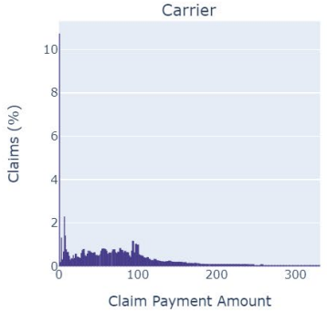
Carrier claims pile up under $50. These are your physician visits, your E&M codes, your bedside debridements. Individually tiny. The tail barely reaches $300. But these are also the highest-volume claims in the system. A wound care patient might generate dozens of them over an episode. The cost story here isn’t about any single claim. It’s about accumulation.
Inpatient
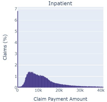
Inpatient is where the real financial risk lives. Most claims sit under $10,000, but there’s a long tail stretching past $40,000. Those tail cases aren’t rare statistical anomalies. They’re your amputations, your flap reconstructions, your sepsis admissions. Here’s the important intuition: if an early intervention, say an advanced dressing or a timely surgical debridement, prevents even a few patients from reaching that tail, the cost savings are enormous. Not because you moved the average. Because you removed draws from the expensive part of the distribution. That’s a fundamentally different argument than “we reduced the mean cost per patient,” and it’s a much stronger one.
DME
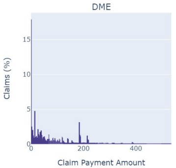
DME is the panel I keep coming back to. There’s a spike near $20–50, a gap, and a second cluster around $200–250. You’re looking at two different markets wearing one label. The left cluster is commodity supplies: dressings, gauze, wound contact layers. The right cluster is equipment: NPWT units, support surfaces. If you’re a supplier and someone quotes you the average DME payment as a benchmark, notice that the average falls in the gap. Almost no actual claims live there. The average describes a place where no one is.
Think about what that means for reimbursement strategy. If your product sits in the left cluster, you’re competing on volume against a crowded field of low-cost commodities. If you sit in the right cluster, you’re justifying a higher per-claim payment against a smaller set of comparators. These are different business problems. The average treats them as one.
Hospice
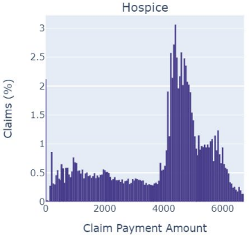
Hospice has a sharp peak around $4,000–5,000 with a hard edge on the right. That edge is the per diem rate ceiling. CMS sets a daily rate, and that rate caps what the hospice can receive. The shape of the distribution is the shape of the policy. For clinicians managing wounds in hospice patients, the implication is straightforward: wound care doesn’t get its own budget. It competes for resources within a fixed daily payment alongside every other service the patient needs. Your clinical argument for a particular therapy has to account for that constraint, because the reimbursement already does.
HHA
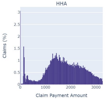
HHA is multimodal. Several visible peaks spread from $1 to $3,000. Each peak corresponds, roughly, to a case-mix payment group under CMS’s Patient-Driven Groupings Model. The payment system assigns patients to tiers based on clinical characteristics, functional status, and admission source, and each tier gets a different payment. For researchers, this is critical. If you’re studying home-based wound care costs and you see variation in payments, some of that variation is clinical and some of it is the payment structure itself. If you don’t separate the two, you might conclude that a treatment affects cost when really it just shifts patients between payment groups.
SNF
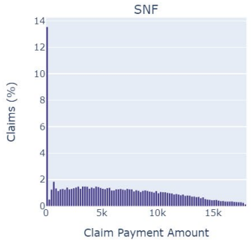
SNF has a large spike near zero with a thin tail. The per diem bundled payment compresses most claims into a narrow band. Wound care delivered in a SNF is, economically speaking, invisible in the claims data. It’s absorbed into the daily rate. For suppliers, this means the clinical value of your product in the SNF setting doesn’t show up as a separate line item. The value argument has to be about length of stay, about getting the patient out of the SNF faster, because that’s what shows up in the data.
Outpatient
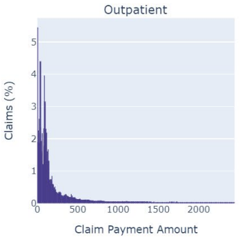
Outpatient is right-skewed, most claims under $500 with a tail past $2,000. These are your hospital outpatient department visits, where facility fees add to the cost of the same procedures that look cheap in the Carrier panel. A debridement billed under the physician fee schedule is a $30 Carrier claim. The same debridement performed in a wound care center operating under OPPS might be a $300 Outpatient claim. Same procedure. Different distribution. Different payment rule.
The shapes tell you how the system works
Here’s the thing I want you to take away from all of this.
A patient with a chronic wound doesn’t live in one panel. Over the course of an episode, they accumulate claims across Carrier, Outpatient, DME, HHA, and possibly SNF and Inpatient. Their total cost is the sum of draws from these different distributions. And since each distribution has a different shape, driven by a different payment rule, the total doesn’t simplify to anything tidy.
When someone presents the “average cost of a wound care episode,” they’ve taken this complex, multi-setting, multi-mechanism process and collapsed it into one number. That number might be fine for a budget projection. It’s less useful for understanding where the money actually goes, where the intervention points are, and where the financial risk concentrates.
The risk concentrates in the tails. The intervention points are where you can prevent patients from entering expensive settings. And neither of those things is visible in an average.
Look at the distributions. The shapes tell you how the system works.
Data: CMS Synthetic Medicare Claims PUFs User Guide (May 2023), Figure 4-8.
Comments or questions? Add them under the LinkedIn post.