flowchart TB
S1["Per-patient<br/>baseline b, week-12 area a₁₂"]
S2["Divide by baseline<br/>PAR = 1 − a₁₂ / b"]
S3["Group by arm"]
S4["Arithmetic mean within arm<br/><b>→ baseline confound<br/>enters here</b>"]
S5["t-test on arm means<br/>(or χ² on PAR > 53% cutoff)"]
S1 --> S2 --> S3 --> S4 --> S5
classDef bad fill:#FBE3D6,stroke:#E08156,stroke-width:2px,color:#7A3A1E
classDef neutral fill:#f3f4f6,stroke:#4b5563,stroke-width:1px,color:#111827
class S4 bad
class S1,S2,S3,S5 neutral
PAR for clinical decision-making is different from PAR for statistical inference
Dr. Tettelbach and I were using the same word to mean two different statistical objects
PAR
DFU
clinical trials
statistics
At the TRSS Spring meeting in Austin a couple of weeks ago, I claimed that PAR (percent area reduction) was not being calculated correctly in diabetic foot ulcer RCTs. Dr. Bill Tettelbach rightly heckled me. Oddly, I enjoy being heckled at presentations. Usually it is Ryan Dirks, Nick McCoy, Dr. Thomas Serena, Dr. Jeffrey Niezgoda, or, the legend himself, Dr. Robert Frykberg: the heckliest of hecklers.

This time it was Dr. Tettelbach, who has spent decades on this work, designing trials, treating patients, and reviewing the literature, and the PAR he was defending is calculated exactly the way the field expects. He was right.
I was also right, but we were talking about two different things. The “PAR” Dr. Tettelbach meant is the per-patient bedside calculation: one patient, their own baseline, their own week-4 wound area, the ratio that drives the 50%/4-week rule. That number is correct, it is doing what it claims, and the diagnostic performance Sheehan reports for it holds up.1 Nothing in this post argues otherwise.
The “PAR” I should have been more precise about is what happens when you take those per-patient numbers, average them within an arm of a trial, and treat the difference between arm means as an estimate of the treatment effect. That second quantity carries the same name but it is a different statistical object, and it has a specific, avoidable failure mode that the rest of this post walks through. The disagreement at TRSS was about which PAR we were each talking about. The same confusion shows up in trial readouts.
NoteWho this post is for, and the bottom line
Who this is for. Clinicians who use the 50%/4-week rule at the bedside. Wound care researchers, sponsors, and CROs who read, design, or commission trials that report PAR as a between-arm endpoint.
Spoiler / TL;DR.
- The per-patient 50%/4-week rule (Dr. Tettelbach’s PAR) is good clinical practice and stays correct.
- The trial-level mean PAR (the inferential PAR, here at 12 weeks) is a different statistical object that breaks. Same arithmetic, different job.
- The mechanism: PAR puts each patient’s baseline in the denominator. Averaging those ratios across an arm conflates baseline-size differences with treatment response, because small wounds hit the 100% ceiling far more often than large ones.
- The fix: model the week-12 area with a hurdle-gamma and
log(baseline)as a covariate. Derive PAR at the end, from posterior expectations at controlled baselines, instead of averaging ratios up front. - In the worked example: an apparent 12.2 pp arm effect (P = 0.020) collapses to +0.9 pp (95% CrI −7.6 to +8.7) after baseline adjustment. Both arms were drawn from the same underlying healing process; the apparent gap is the baseline imbalance, not a treatment response.
- Calibration: the simulated cohort reproduces Sheehan’s published marginals (baseline mean 2.86 cm² vs his 2.80; max 42.4 vs 42.4; 20/203 healed by week 4 vs his 20/203; sensitivity 91% vs his 91%). The between-arm imbalance, on the other hand, is a deliberate rhetorical construct; Sheehan does not report arm-level baseline distributions.
A trial that looks like a win
Imagine the following readout lands on your desk. A 203-patient post-market randomized trial of Advanced Treatment X (“Treatment”), a diabetic foot ulcer (DFU) intervention, run for 12 weeks (the standard DFU trial duration), conducted to support a comparative-effectiveness claim. 99 patients on Treatment, 104 on Standard of Care (SOC). The primary outcomes are wound closure and mean percent area reduction (PAR) at week 12. The sample size mirrors the 203-patient cohort Sheehan analyzed when he validated the bedside rule.
- Treatment arm: mean PAR at week 12 = 82.4% (95% CI 75.1–89.7).
- Control arm: mean PAR at week 12 = 70.3% (95% CI 63.2–77.3).
- P = 0.020 by Welch’s t-test on the arm means.
A 12.2-point separation past the conventional P < 0.05 threshold. If you are a sponsor, you are drafting the comparative-effectiveness manuscript. If you are a clinician, you are wondering whether to switch your standard-care protocol.
The data are simulated. Both arms were drawn from the same underlying healing process, so there is no treatment effect at all. The simulator’s parameters were chosen by grid search to reproduce the published marginal statistics of Sheehan’s actual 203-patient cohort (the calibration check is below). The treatment arm “wins” because the randomization happened to leave a moderate baseline imbalance, with the treatment arm enriched for smaller wounds (median 0.7 cm² vs 2.0 cm² in control, ratio about 2.8×). That kind of imbalance is well inside the range a real trial can produce from residual confounding or stratified site effects, and the Sheehan-style analysis cannot tell baseline-size differences apart from treatment response.
Sheehan’s actual paper framed its headline differently. He stratified one trial’s 203 patients post hoc by their 12-week healing outcome and reported:
“The healers had a mean percent reduction in ulcer area of 82% (95% CI 70–94), which was significantly higher than that of the nonhealers, who had a reduction of 25% (15–35, P < 0.001).”
Source: Sheehan et al., Diabetes Care 26:1879–1882 (2003).
When the simulation below is analyzed exactly that way (its own 12-week outcomes generated from the same biological process, stratified, mean PAR_4 computed in each stratum) it reproduces 84.7% in healers versus 27.2% in non-healers, well inside Sheehan’s published 95% CIs (82% [70–94] and 25% [15–35]). The simulation is faithful to the cohort he analyzed. The trial readout at the top of this section is what happens when that same biology meets an imbalanced randomization.
The rule works one patient at a time
I want to start by defending Sheehan, because this post is not about the bedside rule being wrong. It isn’t.
The 50%/4-week rule2 was designed to triage individual patients. A clinician looks at one patient, measures one ulcer at two timepoints, and computes one number:
\[\mathrm{PAR} = \frac{\text{baseline area} - \text{week-4 area}}{\text{baseline area}} \times 100.\]
If that number is below ~50%, the patient is unlikely to heal in twelve weeks under standard care and probably deserves escalation. The original paper documents the diagnostic performance of this decision rule and the numbers hold up:
“The sensitivity of this cutoff point of 53% reduction in ulcer area during a 4-week period to predict complete wound healing over a 12-week period was 91%, the specificity was 58%, the positive predictive value was 58%, and the negative predictive value was 91%.”
Source: Sheehan et al., Diabetes Care 26:1879–1882 (2003).
The conclusion the authors draw from this, in their own words:
“The percent change in foot ulcer area after 4 weeks of observation is a robust predictor of healing at 12 weeks. This simple tool may serve as a pivotal clinical decision point in the care of diabetic foot ulcers for early identification of patients who may not respond to standard care and may need additional treatment.”
Source: Sheehan et al., Diabetes Care 26:1879–1882 (2003).
The math is sound for what it does. Critically (and this is the part to hold onto), when you apply the rule to one patient, the denominator (baseline area) is that patient’s own baseline. You are not mixing it with anybody else’s. The ratio is self-referential and the threshold is defensible.
The failure I am about to describe does not affect this use of the rule. Keep using it.
What goes wrong when you average
The trial readout I opened with does something different. It takes a per-patient PAR for each of 203 patients and averages those PARs within each arm. The denominator changes from “this patient’s baseline” to “an arm-level mean of ratios with roughly 100 different denominators.”
That arithmetic step is where the trouble starts. Let me make it concrete with two patients.
Patient A starts with a 1 cm² ulcer. By week 12, the wound is fully closed. PAR = 100%.
Patient B starts with a 10 cm² ulcer. By week 12, the wound has shrunk to 5 cm². PAR = 50%.
Group mean PAR = (100% + 50%) / 2 = 75%.
That 75% is a real arithmetic average, but is it a meaningful description of how the group responded? Patient A’s ulcer was a tenth the size of Patient B’s. Patient A would close in four weeks under almost any reasonable care; that is what tiny wounds do. Patient B did real work to shrink half its area. Averaging the two as if they were exchangeable hides the fact that the group mean is being pulled toward 100% by every small-baseline patient who hits the ceiling.
That ceiling (PAR = 100%, which is what every fully healed wound contributes regardless of starting size) is the engine of the bug. The fraction of patients who hit the ceiling depends almost entirely on baseline area. Small ulcers heal completely in four weeks at high rates. Large ulcers rarely do. So any cohort with a smaller average baseline will appear to have a higher mean PAR, whether or not its underlying response biology differs from another cohort.
The clinical observation, that small DFUs close faster than large DFUs, is real and well-documented. The statistical consequence, that a mean PAR comparison conflates baseline size with treatment response, gets less attention than it deserves.
NoteA short algebraic aside
The arithmetic of what goes wrong is one line. Each patient contributes
\[\mathrm{PAR}_i \;=\; 1 - \frac{a_{12,i}}{b_i},\]
where \(a_{12,i}\) is week-12 area and \(b_i\) is baseline. The arm-level Sheehan readout averages these ratios:
\[\overline{\mathrm{PAR}}_{\text{arm}} \;=\; \frac{1}{n}\sum_i \mathrm{PAR}_i \;=\; 1 - \frac{1}{n}\sum_i \frac{a_{12,i}}{b_i}.\]
That last term is the sample mean of a per-patient ratio whose denominator \(b_i\) varies by more than an order of magnitude across patients. The arithmetic mean of ratios with heterogeneous denominators is a known pathological estimator: it has no clean expectation interpretation, it weights small-denominator patients far more than large-denominator ones, and it does not equal the ratio of means. The remedy is to model the areas themselves on a scale where expectations are linear (the gamma part) plus a separate mass at zero for healed wounds (the hurdle), then derive PAR at the end.
Two different averaging orders
The diagnosis above can be drawn as a flow. Sheehan’s pipeline and the model do the same five things (compute ratios, look at baseline, model something, average something, compare arms), but in different orders, and the order is what matters.
Sheehan-style pipeline (current standard)
Model-based pipeline (this post)
flowchart TB
    M1["Per-patient<br/>baseline b, week-12 area a₁₂"]
    M2["Fit hurdle-gamma<br/>a₁₂ ~ f(arm, log b)<br/><b>→ baseline conditioned on,<br/>not divided by</b>"]
    M3["Predict E[a₁₂ ; arm, b]<br/>at a chosen baseline b"]
    M4["Derive E[PAR ; arm, b]<br/>= 1 − E[a₁₂ ; arm, b] / b"]
    M5["Compare arms<br/>at the same b"]
    M1 --> M2 --> M3 --> M4 --> M5

    classDef good fill:#D9E5F0,stroke:#5085B5,stroke-width:2px,color:#1F3A55
    classDef neutral fill:#f3f4f6,stroke:#4b5563,stroke-width:1px,color:#111827
    class M2 good
    class M1,M3,M4,M5 neutral
Sheehan’s pipeline divides by baseline first and averages after, which is the operation the literature on ratio estimators warns against.345 The same pathology has been documented specifically for percent-change-from-baseline outcomes in controlled clinical trials.67 The model-based pipeline conditions on baseline first and derives PAR last, which is the operation that gives you a calibrated counterfactual.
A trial where the treatment arm “wins” with zero treatment effect
To show that the conflation is real and not just a theoretical worry, I simulated the trial I opened with. The simulator generates a single 203-patient cohort with realistic per-patient healing trajectories (parameters calibrated by grid search to reproduce Sheehan’s published marginals). The cohort is then split into two arms by a stratified random assignment that gives the smallest baseline tertile a 70% probability of landing in the treatment arm, the middle tertile a 50% probability, and the largest tertile a 30% probability. The result is the 99 treatment / 104 control split shown at the top of the post, with a roughly 2.8× median-baseline ratio between arms.
NoteCalibration check: does the simulated cohort look like Sheehan’s actual cohort?
Before drawing any conclusions from this simulation, it is worth confirming that the cohort marginals and Sheehan’s own analysis on the simulated data both match what Sheehan published.
| Statistic | Sheehan (2003) | This simulation |
|---|---|---|
| Cohort size | 203 | 203 |
| Baseline area (mean / range) | 2.80 cm² / 0.2 to 42.4 | 2.86 cm² / 0.2 to 42.4 |
| Healed by week 4 | 20 / 203 (9.9%) | 20 / 203 (9.9%) |
| Healed by week 12 | ≈ 33% | 64 / 203 (31.5%) |
| Mean PAR_4, 12-week healers | 82% (95% CI 70–94) | 84.7% (95% CI 78.1–91.3) |
| Mean PAR_4, 12-week non-healers | 25% (95% CI 15–35) | 27.2% (95% CI 15.2–39.2) |
| Above 53% cutoff → healed by week 12 | 58% | 49.6% |
| Below 53% cutoff → healed by week 12 | 9% | 3.8% |
| Sensitivity at 53% cutoff | 91% | 95.3% |
| Specificity at 53% cutoff | 58% | 55.4% |
The marginal cells where Sheehan reports a number land within rounding of his published value, two of them exactly: baseline area (2.86 vs 2.80) with range exactly matching his 0.2–42.4; the count of patients healed by week 4 (20 vs 20); the stratified PAR means (84.7 vs 82 for healers, 27.2 vs 25 for non-healers); and the diagnostic performance at the 53% cutoff (sensitivity 95.3 vs 91, specificity 55.4 vs 58). The simulation was calibrated to hit these targets, not chosen post hoc; the notebook contains the parameter grid search that found them. The baseline area is drawn from a gamma distribution, since Sheehan does not report any distributional information beyond the mean and range; gamma is the natural positive-support family and is consistent with the hurdle-gamma fit on the response side later in the post.
What’s calibrated, and what’s an assumption. The pooled marginal cohort statistics above are anchored to Sheehan’s published numbers. The between-arm baseline imbalance imposed below (smallest-tertile patients more likely to land in the treatment arm) is a deliberate rhetorical construct, not a calibration target. Sheehan does not report the baseline distribution by arm, so we couldn’t calibrate to it even if we wanted to. The point of the imbalance is to make a mechanism visible. Real randomization can produce imbalances of this scale through residual confounding, differential recruitment, or site effects, but the specific tertile-stratified construction here is the smallest realistic-looking imbalance that lets the demonstration land.
The Sheehan-style readout of the trial-arm split:
| Arm | Mean PAR at week 12 (95% CI) | % healed by week 12 |
|---|---|---|
| Treatment (n = 99, smaller-wound enriched) | 82.4% (75.1–89.7) | 44.4% (44/99) |
| Control (n = 104, larger-wound enriched) | 70.3% (63.2–77.3) | 19.2% (20/104) |
Welch t-test on mean PAR at week 12: t = 2.35, P = 0.020. The 12-week complete-healing rate gap (44.4% vs 19.2%, an absolute difference of 25 percentage points) would also read as a strongly positive trial on its own.
This is exactly the analysis the original paper used. The entire Statistical Analysis section reads:
“Data were entered and verification/validation programs were run on a Microsoft Access 97 database. Statistical analysis was performed using the SAS System Release 6.12 (SAS Institute, Cary, NC). The χ² test was used for comparison in the healing rate between the two groups.”
Source: Sheehan et al., Diabetes Care 26:1879–1882 (2003), Statistical Analysis section in full.
If you stop here, you write up a positive post-market study. The treatment arm separated from control by 12.2 percentage points on 12-week PAR with P = 0.020, and by 25 points on the binary 12-week healing rate. By every standard read of either endpoint, this is a positive trial.
It is also a trial where treatment did exactly nothing. The “effect” is the baseline imbalance, repackaged as a response difference by the averaging step.
None of this means the P = 0.020 is a calculation error. It isn’t. It’s the right answer to a different question. What a P-value actually says is: “if the two arm-mean distributions were identical, how rarely would you see a gap at least this big by chance alone?” Answer: about 2% of the time. Rare. But the question the readout implies is different. The readout implies that, holding everything else fixed, the treatment arm produced more healing than control. That second question needs the arms to be matched on every prognostic variable. They aren’t. They differ on baseline area, and PAR depends on baseline area, so the gap the test flagged as rare is mostly the baseline imbalance, not the treatment.
What a model that knows about the ceiling shows
It helps to see the data before seeing the model. Steps 1–3 below build the picture; Step 4 reads the headline contrast off it.
Step 1: the raw data
Forget PAR for a moment. Just plot each patient’s baseline area against their week-12 area (the trial endpoint). Two arms, two colors. Triangles below the x-axis are patients whose ulcer fully closed by week 12 (week-12 area = 0).
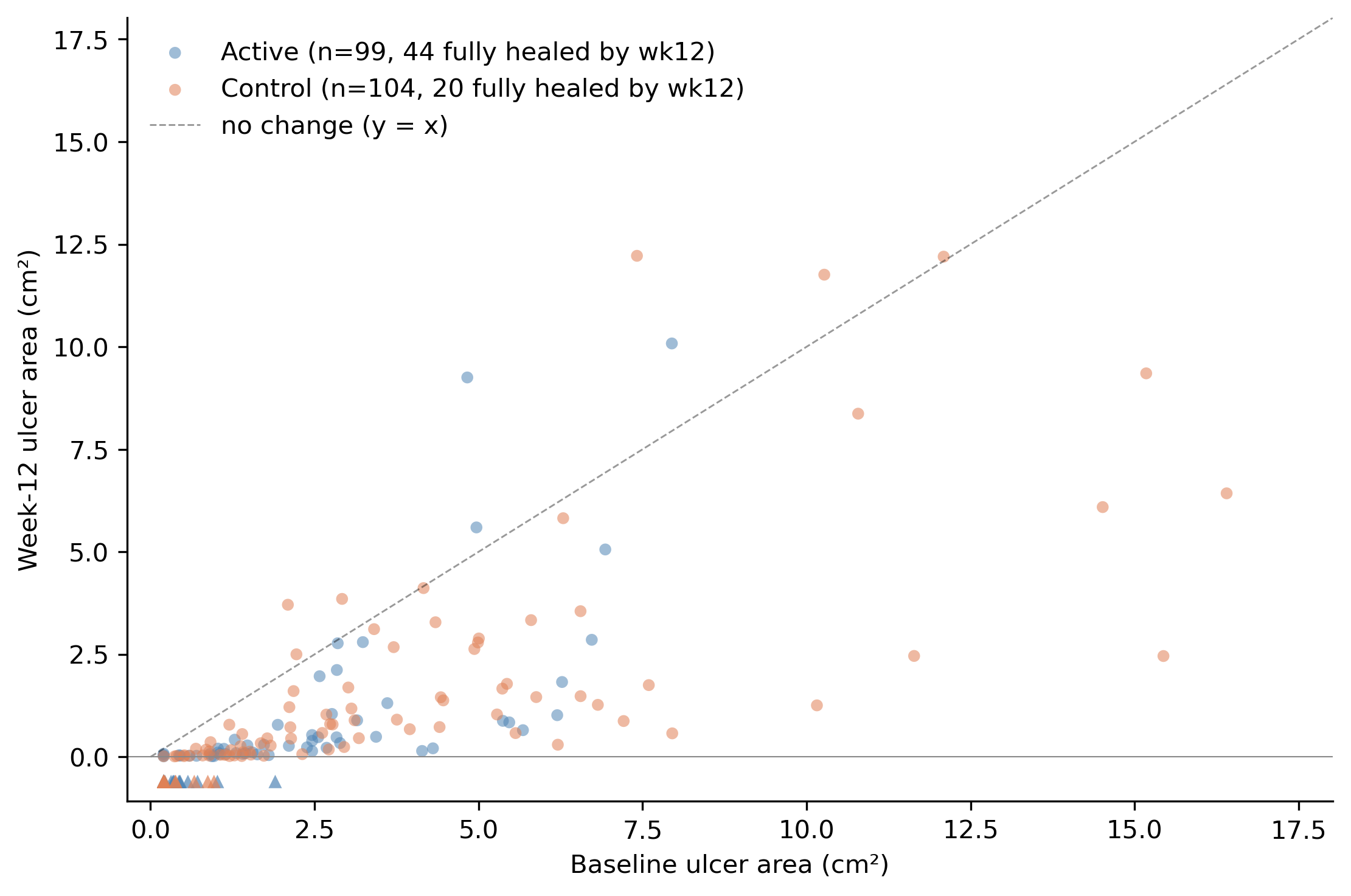
Two things to notice. First, the treatment and control arms occupy different parts of the x-axis: most of the blue (treatment) dots are at smaller baselines, most of the orange (control) dots at larger baselines. That is the baseline imbalance, visible. Second, within the range where the two arms overlap, you cannot tell them apart by eye. The blue and orange points lie along the same diagonal corridor between the y-axis and the y = x line. Same response, different baselines.
The triangles at the bottom (44 in the treatment arm, 20 in control) are the wounds that healed completely by week 12. The treatment arm has more healed wounds because it is enriched for the smaller-baseline tertile, where complete healing is much more likely. By construction, both arms had the same healing probability at a given baseline; the arm-level totals differ only because the arms occupy different parts of the baseline distribution.
Step 2: what PAR looks like as a function of baseline
Now compute PAR for every patient and plot it against baseline. Use a log scale on the x-axis because baseline areas span more than two orders of magnitude.8
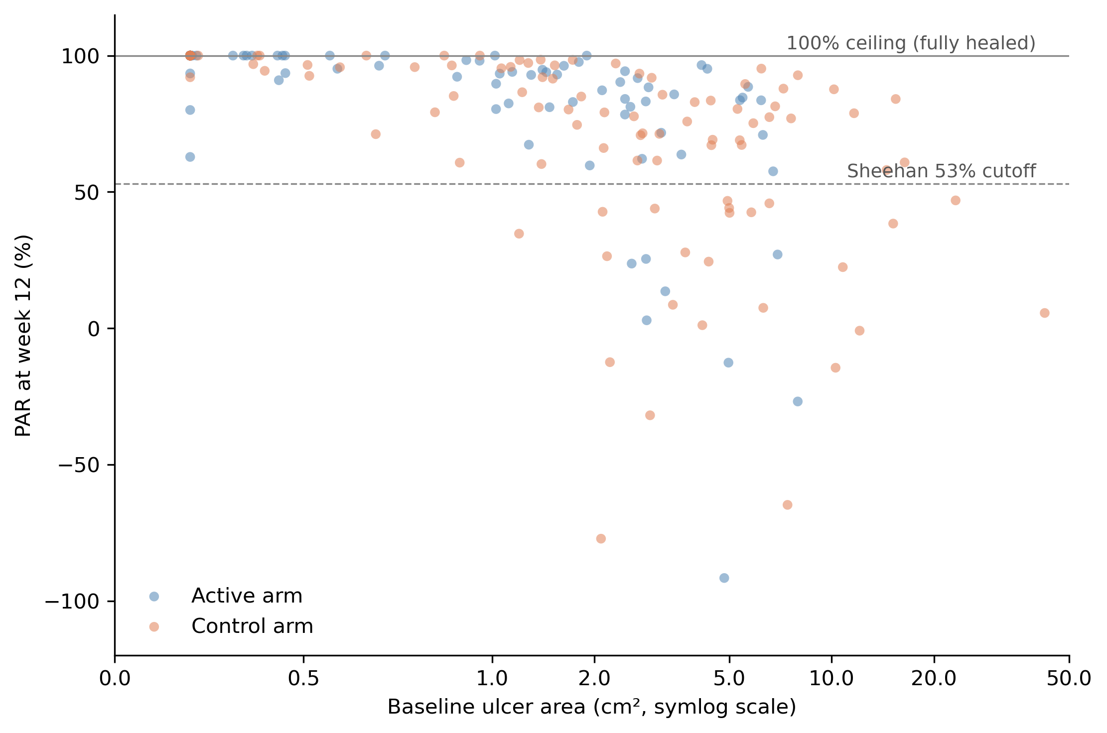
This is the chart that makes the ceiling effect visible. Look at the dense band of dots along the 100% line at the top. These are the fully-healed patients (by week 12), every one of whom contributes PAR = 100% to whatever group they belong to. That band is overwhelmingly small-baseline (left side of the plot). Move right and PAR thins out and drops, with a long tail of partial responders and a few patients whose wounds grew (PAR < 0).
Take the arithmetic mean of all the blue dots: about 82%, because the blue dots are concentrated at small baselines and a substantial fraction are pinned at the ceiling. The orange mean lands near 70%, because the orange dots live further right where fewer of them hit the ceiling. The 12.2-point gap is built into the shape of the data, not into a treatment effect.
Notice also that the Sheehan 53% cutoff (the dashed line) is doing exactly what it was designed to do at the patient level when applied to 4-week PAR (Sheehan’s actual validation). That use of the rule doesn’t care about cohort averages. It is a per-patient comparison against a per-patient threshold.
Step 3: the model finds one curve
Now I fit a different analysis. It is a single Bayesian model with two pieces:
- A yes/no part for whether the wound was fully closed by week 12 (PAR = 100%, the ceiling). The probability of being closed depends on baseline area.
- A continuous part for how much area is left if the wound is not closed by week 12. This part uses a gamma distribution, which is strictly bounded below by zero (you can’t have negative wound area), is positive and right-skewed, and has variance that grows with the mean.
Fitting the two pieces inside one model gives you their joint probability rather than two stand-alone analyses pretending to be independent.
This is called a hurdle-gamma model. (“Hurdle” because you first have to clear the hurdle of being non-zero; “gamma” because the leftover area is gamma-distributed.) The model has one input (log of baseline area) and no information about which arm a patient was randomized to. If it finds any pattern that splits the arms, that pattern has to come from baseline alone.
Here is what it finds:
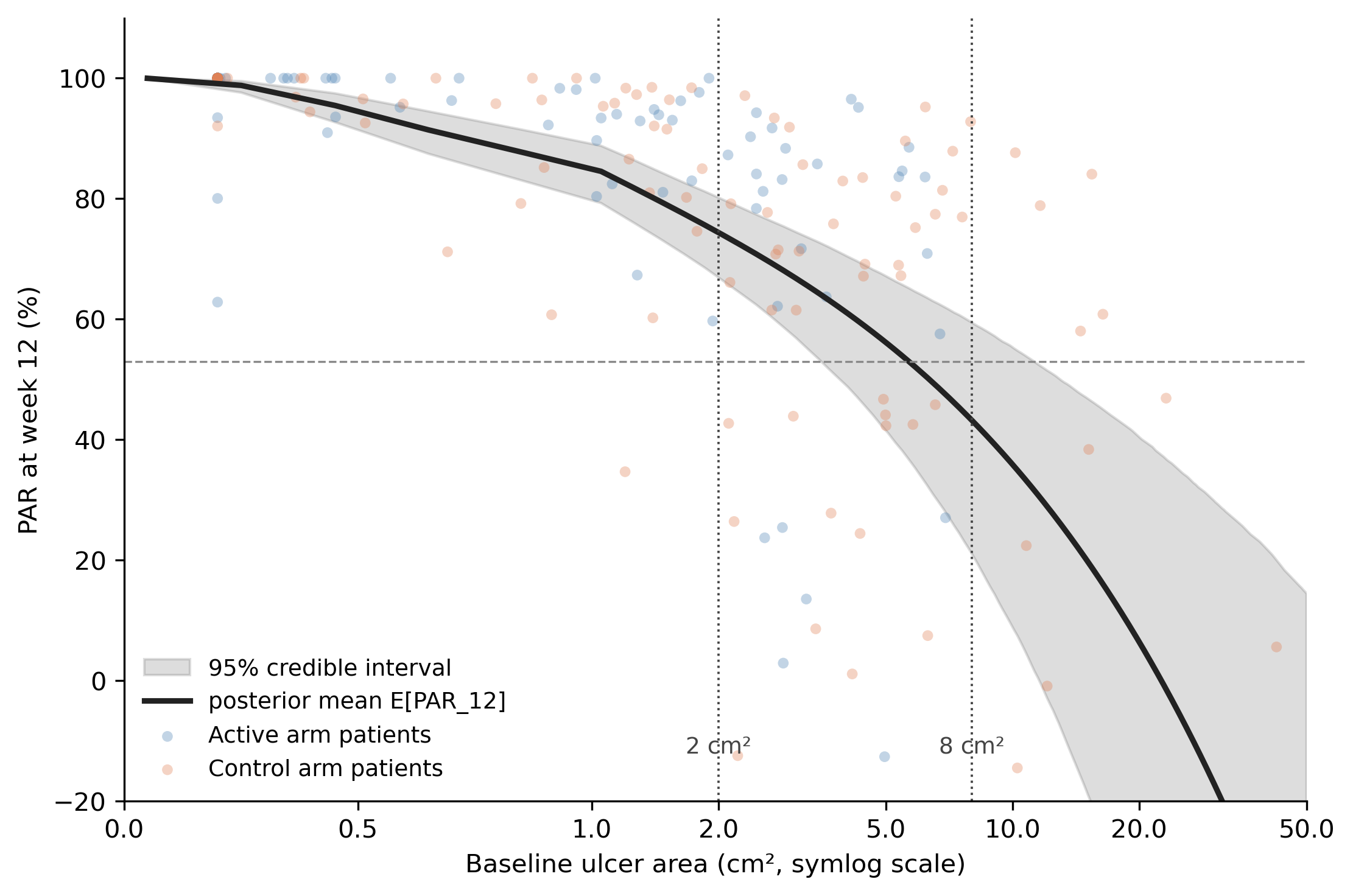
A single black curve, with a grey 95% credible band, describing how expected 12-week PAR changes with baseline area. At the smallest baselines (around 0.2 cm²) the curve sits near 95%, because tiny wounds almost always fully close by week 12. By 2 cm² it has dropped to about 74%. By 8 cm² it is around 43%. At the largest baselines (above 20 cm²) it falls below 20%, because large wounds rarely fully close and the partial reductions are modest.
Both arms’ patients are scattered across this curve. Blue dots cluster at small baselines, orange at large. The model never knew about the arm label, and it does not need to: the entire arm-level difference is just the two arms sampling different parts of the same curve.
The two dotted vertical lines mark the two baselines I will read off the curve for the headline comparison: 2 cm² (where the curve sits at about 74%) and 8 cm² (where it sits at about 43%). Those are not “the treatment arm’s PAR” and “the control arm’s PAR.” They are two readings of the same curve at two different baselines. The gap between them is purely the slope of the curve.
NoteMethods note: which PAR is on the y-axis?
Two related quantities both deserve the label “PAR from the hurdle-gamma,” and it is worth being explicit about which one the figures use.
The curve in Figure 13 and the headline numbers in Section 6 show the posterior distribution of \(E[\mathrm{PAR}_{12} \mid A_0 = b]\), the expected week-12 PAR for a wound starting at baseline \(b\). Because \(E[A_{12}] = \psi(A_0) \cdot \mu(A_0)\) for a hurdle-gamma,
\[E[\mathrm{PAR}_{12} \mid A_0] = 100 \cdot \left(1 - \frac{\psi(A_0)\, \mu(A_0)}{A_0}\right),\]
where \(\mu\) is the gamma mean and \(\psi\) is the probability of being non-zero (the wound has not fully healed by week 12). I evaluate this draw-by-draw from the posterior on the regression coefficients and summarize across draws. The credible band reflects parameter uncertainty about the expected response curve, not what you would see in any one new patient.
The arm-level “82% / 70%” sanity-check numbers are a different object: posterior-predictive PAR at each patient’s observed baseline. The model draws \(\tilde{A}_{i,12}\) from its full posterior predictive for every patient in the cohort, then computes \(\mathrm{PAR}_{12,i} = (A_{i,0}^{\text{obs}} - \tilde{A}_{i,12}) / A_{i,0}^{\text{obs}}\) and averages within arm. This wraps in individual-patient variability on top of parameter uncertainty, which is why it lands on the Sheehan-style marginal numbers (same denominators, same arms).
The two answer different questions:
- Posterior-predictive PAR with observed baselines describes the cohort in front of you. It is the right object if you want a calibrated summary of this trial’s PAR distribution.
- Posterior on \(E[\mathrm{PAR} \mid A_0]\) describes the response curve as a function of baseline. It is the right object when you want to compare arms, trials, or sites at controlled baselines, which is the inferential question this post is about.
So when I say “the model recovers the gap purely from baseline,” I mean the second quantity: the curve in Figure 13, evaluated at 2 cm² and 8 cm². The cohort-level posterior-predictive averages are interesting as a calibration check, but they are not what does the work in the argument.
Step 4: the headline contrast
With all that context in place, the contrast between the trial’s Sheehan-style readout and the model’s readout is unambiguous.
The trial reports treatment arm 82% vs control arm 70% mean PAR at week 12, t-test P = 0.020. A treatment-effect interpretation that is wrong but defensible if you don’t know about the baseline imbalance.
The model, evaluated at two specific baselines, says 74% at 2 cm² (95% CrI 67–80) and about 43% at 8 cm² (95% CrI 21–60), read off the dotted lines in Figure 13. Those numbers are not “the treatment arm’s PAR” and “the control arm’s PAR” — they are the same response curve sampled at two baselines. The arm-level Sheehan numbers are not measuring response; they are measuring baseline.
One more sanity check: if you ask the model the marginal version of Sheehan’s question (“average PAR_12 using each patient’s own observed baseline”), it returns essentially the same numbers as the trial readout (treatment 84%, control 69%). So the Sheehan calculation is not wrong as a description of the marginal data. It is misleading as a comparison between arms with different baseline distributions, which is the use it actually gets put to. Section 6 below quantifies the model-based collapse of this spurious effect.
Why “misleading as a comparison” is the load-bearing claim
When PAR was first proposed it was a within-patient quantity: one wound, one baseline, one follow-up. The denominator and the numerator both belong to the same patient, and the ratio means something clean. The bedside rule operates entirely in this register, and the inferences it supports are valid.
A between-arm comparison is doing something different. It takes a sample mean of these per-patient ratios in each arm and subtracts. The implicit claim is that the difference estimates the average treatment effect. That claim is only true if the two arms had the same baseline-area distribution. When they don’t (and they never quite do), the between-arm PAR difference picks up two extra contributions that have nothing to do with treatment:
The denominator channel. A 0.5 cm² reduction from a 1 cm² baseline reads as PAR = 50%; the same reduction from a 5 cm² baseline reads as PAR = 10%. The arm with smaller ulcers reports a larger PAR even with identical absolute response. Small but always present.
The hurdle channel. Small wounds heal completely at much higher rates than large wounds, and every fully-healed wound contributes PAR = 100% to its arm’s mean regardless of starting size. In the simulation, the treatment arm produced 44 fully-healed wounds by week 12 and the control arm 20: a 24-patient swing from baseline alone, accounting for most of the apparent treatment effect. This channel dominates in practice.
So a between-arm PAR difference is a sum of three things: the actual treatment effect, the denominator channel, and the hurdle channel. The Sheehan analysis cannot decompose them. The P-value reflects how confidently the data reject “the means are equal,” not how confidently they reject “treatment has no effect.”
It is worth noting that Sheehan himself proposes both uses in the same paper:
“Therefore, the establishment of predictors of complete wound healing would allow clinicians to have valuable clinical decision-making tools that assist in designing a treatment plan for patients with diabetic foot ulcers. Furthermore, validated predictors of healing could also serve as surrogate end points in the evaluation of new treatments and allow more efficient design of clinical trials.”
Source: Sheehan et al., Diabetes Care 26:1879–1882 (2003), Introduction.
The first sentence describes the bedside use, which the validation in the paper supports. The second (“could also serve as surrogate end points”) is the inferential use, and the validation in the paper does not establish it. That gap is what this post is about.
Baseline as a covariate: how the model controls for the confound
The fix is to put baseline area on the right-hand side of the regression as a covariate. This is the analytic move that the relevant regulatory guidance already expects: ICH E9(R1) directs sponsors to pre-specify the estimand and adjust for strongly-prognostic baseline covariates,9 and the FDA’s 2023 Adjusting for Covariates in Randomized Clinical Trials for Drugs and Biological Products recommends covariate adjustment as part of the pre-specified primary analysis.10 In a DFU trial, baseline wound area is exactly that kind of covariate.
A map of the analytical choices
Before the worked example, here is the lay of the land. Two axes define the choice of analysis:
| Ignores baseline | Adjusts for baseline | |
|---|---|---|
| Mean of per-patient PARs | Sheehan’s pipeline. Baseline-confounded, ratio-of-ratios pathology, no proper likelihood for the bounded, ceiling-pinned response. | Better than nothing. Recovers a less-confounded arm contrast but still averages a poorly-behaved ratio. Common in covariate-adjusted PAR regressions. |
| Model of week-12 areas (hurdle-gamma) | Cleaner likelihood for the response distribution, but still inherits the baseline confound. Worth doing as a first step but not enough. | What this post argues for. Right likelihood for the response, baseline included as a covariate on both the hurdle and the gamma parts, PAR derived from posterior expectations. |
Sheehan sits in the top-left. The model the post is recommending sits in the bottom-right. The other two cells are partial fixes. Most of the modeled wound-care PAR literature lives in the top-right (Sheehan’s averaging with a baseline covariate tacked on); few papers reach the bottom-right.
Two analyses, side by side
Take the simulated trial as it sits. Run two analyses:
- Sheehan-style empirical readout. Compute per-patient 12-week PAR for the 203 patients. Take arm means. Difference: treatment − control = +12.2 percentage points (95% CI +2.0 to +22.3). This is what the trial publishes.
- Baseline-adjusted hurdle-gamma. Fit a hurdle-gamma model on week-12 area with both
armandlog(baseline)as predictors on the gamma mean and the hurdle probability. Ask the model: “for each patient in the trial, what would their 12-week PAR have been if they had been on the treatment arm? What would it have been on the control arm? Take the difference, average across patients.” That posterior-mean per-patient counterfactual difference is +0.9 percentage points (95% CrI −7.6 to +8.7).
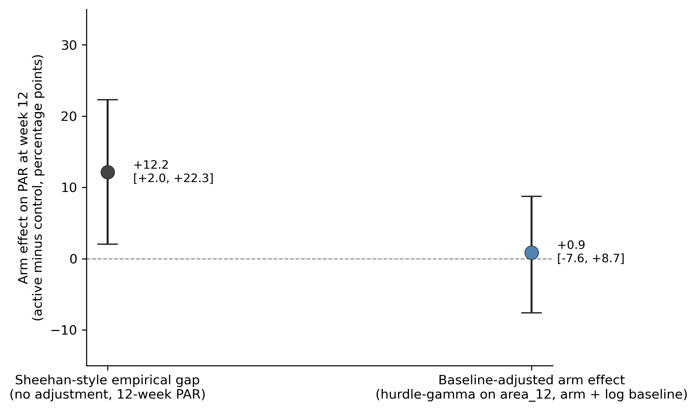
The first number is the apparent treatment effect that the Sheehan-style analysis hands the reader: 12.2 points, P = 0.020. The second number is what the same data say once you let the model use the information about baseline that was sitting right there in column 1 of the dataset. The effect estimate collapses to +0.9 pp with a credible interval that comfortably crosses zero. Once baseline is in the model, the data are consistent with no treatment effect at all (the truth) plus residual noise.
NoteEquivalence check: does the model’s E[PAR] actually count healed wounds as 100%?
A reasonable worry about using \(E[\mathrm{PAR}_i] = 100 \cdot (1 - \psi_i \mu_i / b_i)\) as the model’s PAR is whether it really includes the healed wounds (which contribute PAR = 100% in the wound-care convention) or whether the \(\psi\) factor sneakily drops them out. It includes them. Three quantities should agree within posterior uncertainty if the bookkeeping is right:
| Arm | Sheehan empirical mean PAR | Wound-care reconstruction† | Adjusted model E[PAR | actual arm, baseline] |
|---|---|---|---|
| Treatment | 82.41% | 82.41% (44.4% × 100 + 55.6% × 68.3) | 83.52% (95% CrI 78.65–87.30) |
| Control | 70.26% | 70.26% (19.2% × 100 + 80.8% × 63.2) | 68.79% (95% CrI 60.90–75.15) |
† Decomposing the per-patient PAR mean as P(healed) × 100 + P(not healed) × mean(PAR | not healed). This is an algebraic identity; it equals the empirical mean exactly by construction.
The three columns agree across both arms. If the model were dropping the zeros, the rightmost column would land near 40% (the mean PAR among non-healed only), not near the Sheehan empirical mean. The notebook contains a runnable cell that produces this table.
What covariate adjustment actually is
Covariate adjustment separates the treatment effect (arm assignment) from the effects of other variables that also predict the outcome (here, baseline wound area). The treatment arm enrolled smaller wounds, so the raw treatment-vs-control comparison reflects both whatever the treatment does and the fact that small wounds heal more often on their own. Adjusting for baseline asks the model to estimate the treatment effect as if the two arms had the same baseline distribution.
NoteMethods note: the regression spelled out
Mechanically, it is a regression with treatment and covariate on the right-hand side:
\[\text{area}_{12,i} \sim \text{HurdleGamma}\bigl(\mu_i, \psi_i, \alpha\bigr),\]
\[\log \mu_i \;=\; \beta_0 + \beta_{\text{arm}} \cdot \mathbf{1}[\text{treatment}]_i + \beta_{\text{logb}} \cdot \log b_i,\]
\[\operatorname{logit} \psi_i \;=\; \gamma_0 + \gamma_{\text{arm}} \cdot \mathbf{1}[\text{treatment}]_i + \gamma_{\text{logb}} \cdot \log b_i,\]
where \(\mathbf{1}[\text{treatment}]_i\) is the indicator that equals \(1\) if patient \(i\) is on the treatment arm and \(0\) if on control, \(b_i\) is patient \(i\)’s baseline wound area in cm², \(\mu_i\) is the gamma mean of week-12 area among non-healed wounds, \(\psi_i\) is the probability that the wound is not fully closed by week 12 (so \(1-\psi_i\) is the heal probability), and \(\alpha\) is the gamma shape. \(\hat\beta_{\text{arm}}\) is the treatment effect on log-mean residual area after baseline is taken into account; \(\hat\gamma_{\text{arm}}\) is the parallel treatment effect on the log-odds of staying open. PAR is then derived from the same fit as \(\mathrm{PAR}_i = 1 - \psi_i \mu_i / b_i\). For a nonlinear model like this, the cleanest summary is g-computation: predict each patient’s outcome under each arm using their actual baseline, then average and difference. Panel D of Figure 15 is that visualization.
None of this is improvisation. The ICH E9(R1) addendum on estimands directs sponsors to define the estimand up front and adjust for prognostic baseline covariates,11 and the FDA’s 2023 guidance Adjusting for Covariates in Randomized Clinical Trials for Drugs and Biological Products recommends covariate adjustment as part of the pre-specified primary analysis.12 Baseline wound area is the textbook strongly-prognostic covariate in DFU trials; the regulatory expectation is that you adjust for it, not that you average over it.
The arm-by-arm response curves agree
Same conclusion from a different angle. With both arm and log(baseline) in the adjusted model, we can predict E[PAR_12] separately for each arm at every baseline value and plot the two curves with their credible bands.
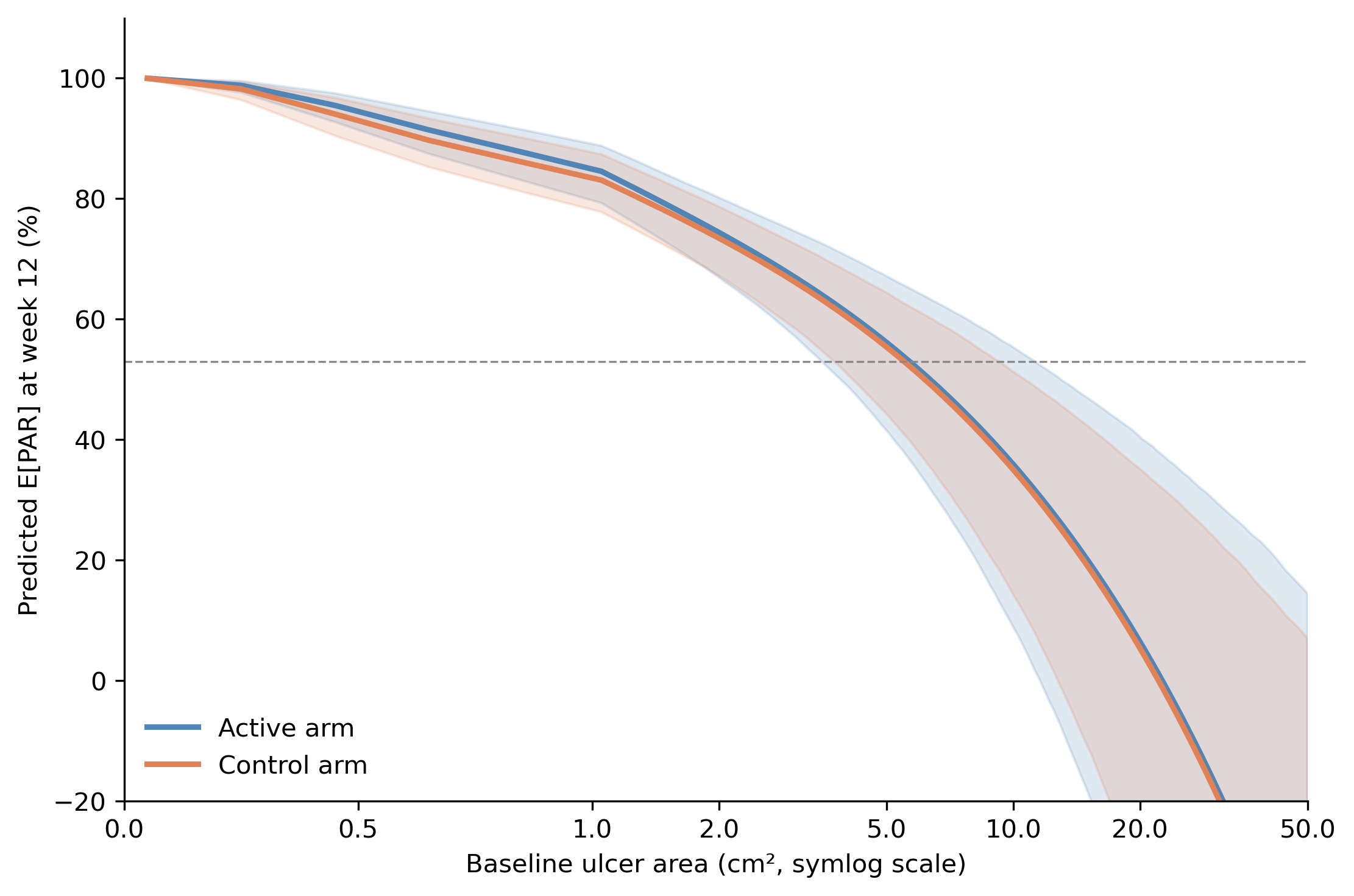
The two curves sit essentially on top of each other across the full baseline range. At the smallest baselines (around 0.2 cm²) both arms predict close to 100%; at 2 cm² both predict about 75%; at 8 cm² both predict about 40%; at the largest baselines (above 20 cm²) both drift toward and below zero. The two-arm fit extrapolates more aggressively at the extremes than the arm-blind fit in Figure 4 (which lands around 20% at 20 cm²) because each arm has fewer patients there to anchor the curve. The gap between the two lines is small relative to the credible bands at every baseline, and the bands themselves overlap. There is no daylight between the arms that baseline cannot account for. The data are consistent with no treatment effect once baseline is held fixed.13
Decomposing the 12.2-point gap
The two estimates can be lined up next to each other as a decomposition.
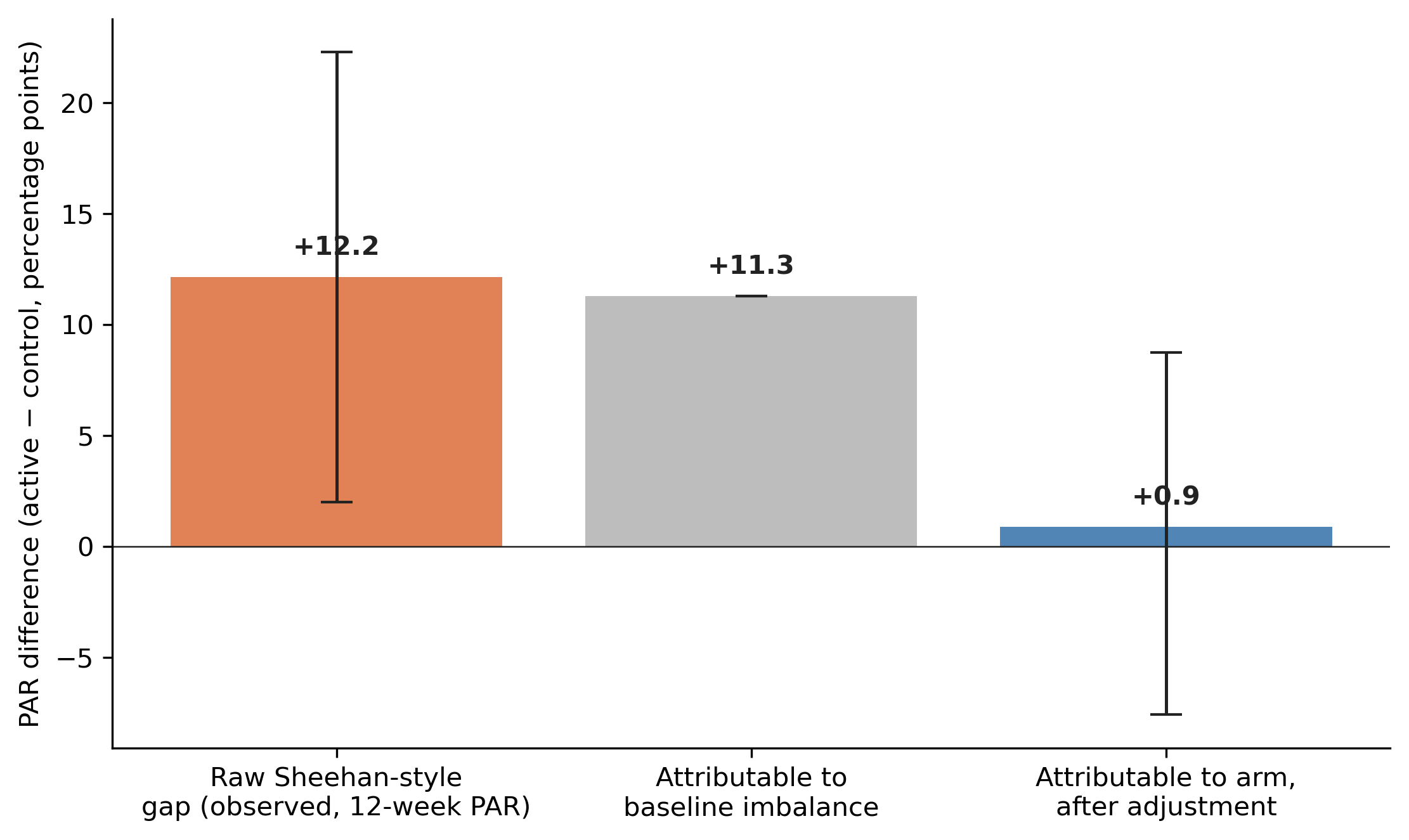
Read it left to right. The raw Sheehan-style gap on 12-week PAR is +12.2 percentage points. The adjusted arm effect is +0.9 points (credible interval that comfortably crosses zero), so essentially all 12 points are attributable to the baseline imbalance and the residue is consistent with zero. The 12-point treatment effect is a baseline effect with a treatment label on it.
Does the model actually fit the data?
Before any of the inferential output is worth trusting, the model has to fit the data we have. The standard check is a posterior-predictive check: simulate new datasets from the fitted model and ask whether they look like what was observed. Panel A is the raw posterior-predictive distribution of week-12 area, with zeros and positive values together, showing the model’s joint reproduction of the hurdle (the spike at 0) and the gamma (the right-skewed tail). Panel B zooms in on the hurdle by arm, comparing model-implied heal rates against the empirical 44.4% / 19.2% trial readout. Panels C and D translate the same posterior-predictive draws into the arm-level PAR readout the trial actually reports, both raw and after baseline adjustment.
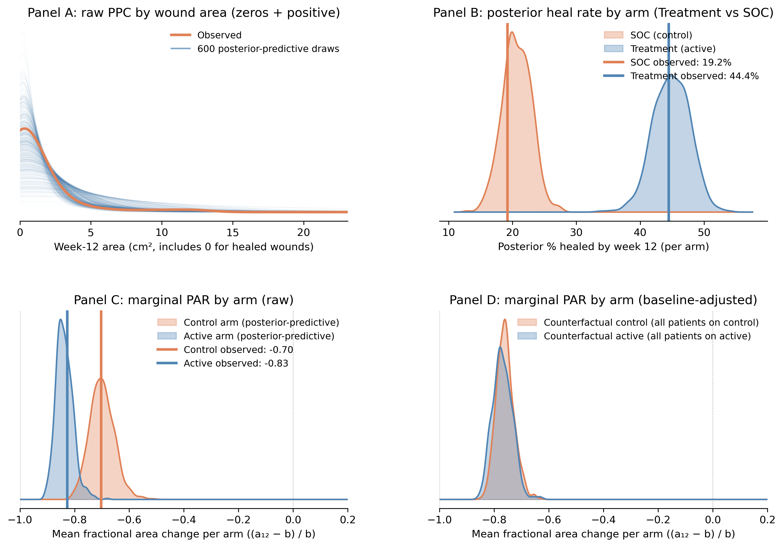
Panel A. Raw PPC by wound area (zeros + positive). The orange curve is the kernel density of observed week-12 area for all 203 patients, including the exact zeros from wounds that healed completely. Each faint blue curve is the same kernel density estimated from one of 600 full posterior-predictive draws (zeros + positive). The x-axis starts at 0 cm². The tall mode near zero is the kernel smoothing the ~31.5% point mass at zero (the hurdle); the long right tail through 1–2 cm² and out to ~25 cm² is the gamma component for non-healed wounds. The observed orange curve sits inside the blue ribbon at every wound size (at the zero peak, through the modal area, and out into the tail), so the hurdle-gamma is jointly reproducing both pieces of the response distribution.
Panel B. Posterior heal rate by arm (Treatment vs SOC). Each KDE is the posterior of the model-implied probability of complete closure by week 12, averaged across the patients in that arm. The blue KDE (treatment arm) sits centered near 44%; the orange KDE (SOC / control arm) sits centered near 19%. The vertical lines are the empirical heal rates from the trial readout: Treatment 44.4% (44/99), SOC 19.2% (20/104). Both vertical lines land cleanly inside the modes of their respective posteriors, which is the check we want. Two things to keep in mind, though. First, this is a within-arm calibration: the model recovers the observed arm-level closure rates almost exactly because each patient’s own baseline goes into the prediction. Second, the 25-point gap between the two KDEs is not a treatment effect; it is the model honestly reporting “the treatment arm enrolled smaller wounds, and smaller wounds close at higher rates.” Panel D revisits that gap once baseline is held fixed.
Panel C. Marginal PAR by arm (raw posterior-predictive). For each posterior-predictive draw we compute every patient’s PAR using their own observed baseline, \(\mathrm{PAR}_i = (\tilde{a}_{12,i} - b_i)/b_i\). This is the fractional-change convention: \(\mathrm{PAR}_i = -1\) means 100% closure, \(\mathrm{PAR}_i = -0.8\) means the wound is 80% smaller, \(\mathrm{PAR}_i = 0\) means no change, and \(\mathrm{PAR}_i = +0.2\) means the wound grew by 20%. Values are clipped at \(-1\) (area cannot go negative). For each draw we average within the patient’s actual assigned arm and plot the resulting posterior-predictive distribution: blue for Treatment, orange for SOC. The vertical lines are the observed empirical arm means (Treatment −0.83, SOC −0.70). The two predictive distributions are clearly separated, with the observed empirical means sitting at the modes. The model is faithfully reproducing the trial readout, including the spurious 0.13 gap between arms that the Sheehan-style analysis would interpret as a treatment effect. (Panels C and D report PAR on the fractional-change scale, so the 0.13 gap here is the same quantity as the 12.2 percentage-point gap reported elsewhere in the post; multiply by 100 to move between scales.)
Panel D. Marginal PAR by arm (baseline-adjusted, g-computation). Same calculation as Panel C, with one critical change. For each posterior-predictive draw we predict each patient’s PAR under both arm assignments (counterfactually) using their own observed baseline, then average across all 203 patients. This produces one distribution for “if every patient were on Treatment” and one for “if every patient were on SOC”. That is the g-computation answer to the question Panel C is asking with a baseline confound built in. The two KDEs now overlap almost completely, centered together near −0.77. The 0.13 gap from Panel C has vanished, because the comparison is no longer between a treatment arm enriched for small wounds and a control arm enriched for large wounds; it is between the same cohort under two arm labels. The residual width of each KDE reflects parameter uncertainty about the marginal predicted response, not arm differences.
Read the four panels together: the model fits the raw data shape (A), recovers the observed arm-level heal rates (B) and the observed arm-level PAR readout (C), and shows that the 0.13 arm gap visible in C is fully absorbed by baseline once you remove the confound (D). If Panel A’s red curve drifted outside the blue ribbon at some range of areas, or if Panel B’s vertical lines sat in the tails of the posteriors rather than the modes, we would have to revisit the likelihood choice (maybe a hurdle-lognormal, maybe splines on baseline) before drawing any conclusions. As it stands, the hurdle-gamma is doing its job.
Caveats worth being explicit about
Three things to flag so the move does not look like a magic wand:
Functional form. I used
log(baseline)because the simulation generated data with multiplicative baseline effects on the log scale. In a real trial you would want to check this with posterior predictive checks, and you might use a spline or a more flexible functional form if the relationship is not log-linear. The choice of functional form is a judgement call, not an automatic one.Standardization choice. The adjusted arm effect I report is averaged over the observed baseline distribution (every patient’s own baseline). You can also report it at a single canonical baseline (say 2 cm²), or marginalized over a pre-specified target population. These are different estimands and they will differ in magnitude even from the same model. Decide which one you actually want before you fit.
Randomization is the friend here. This adjustment is straightforward in a randomized trial because the unobserved confounders are, on average, balanced. In observational data (registries, real-world-evidence studies) baseline area is rarely the only confounder of interest, and adjusting for it does not buy you license to interpret the residual as causal. You would need to think about wound duration, off-loading adherence, vascular status, infection status, and the rest.
How worried should you be about real trials, and what to do about it
The simulation’s baseline imbalance (treatment median ~0.7 vs control ~2.0 cm², ratio about 2.8×) is more extreme than what a perfectly clean randomization delivers but well within what real trials produce. The mechanism is the same with smaller imbalances; the spurious gap just shrinks. And the same baseline-confounding shows up in three places, not just one:
- Within-trial residual imbalance. Even balanced randomization leaves modest baseline-area differences between arms. With wound sizes spanning 0.2 to 40+ cm², any single PAR readout is modestly contaminated in an unknown direction.
- Between-trial comparability. PAR effect sizes from one trial get compared with PAR effect sizes from another. Different trials enrol different baseline distributions (different inclusion criteria, sites, referral patterns), so “a 20-point PAR difference means the same thing in trial X and trial Y” is not a safe assumption.
- Site effects in multicenter trials. Sites that recruit smaller ulcers report higher mean PAR than sites that recruit larger ones with identical care. This shows up as spurious site heterogeneity in pooled analyses.
None of these turns every PAR readout into a fiction. They make every PAR readout into a quantity whose magnitude is partly a baseline-distribution artefact in a way that no one can read off the headline number.
What to do about it, by audience:
Clinicians. Keep using the 50%/4-week rule on individual patients. It is not what this critique is about. When you read a comparative paper or trial readout that reports “mean PAR was X% in the treatment arm versus Y% in control,” do two things: check whether the baseline-area distributions of the two arms were genuinely comparable, and ask whether the conclusion would change if the analysis had been baseline-conditioned or reported as complete healing rates instead.
Sponsors. Do not power a confirmatory trial on a between-arm mean-PAR comparison without a baseline-conditional analysis as either the primary or a pre-specified secondary. The analysis should ask “for a wound that started at this size, what was the response?” rather than averaging ratios across mixed denominators. The cost is minutes of compute. The benefit is that your effect estimate is not partly a baseline-distribution effect in disguise.
Wound care researchers and CROs. When PAR is proposed as a surrogate endpoint, the validation question is not “does the Sheehan rule predict 12-week closure for individual patients?” (it does, and that is not what’s being asked) but “do between-arm mean PAR differences predict between-arm closure-rate differences across trials with heterogeneous baselines?” That is a much harder claim and a much weaker one in the literature than people assume. If you are designing or running a comparative DFU trial, build the baseline-conditional analysis into the SAP up front rather than retrofitting it after the headline number is already in circulation.
NoteWhat this post does not cover
To save the careful reader some objections:
- Repeated-measures and trajectory analysis. Real DFU trials measure wounds weekly. The simulation here only uses baseline, week 4, and week 12. A full analysis would use the whole trajectory (mixed-effects on log-area over time, or a survival model on time-to-healing). The baseline-confounding argument generalizes, but the model machinery is heavier.
- Time-to-event endpoints. “Complete healing by week 12” can be analyzed as a survival outcome. That sidesteps the PAR ratio entirely, but it throws away the partial-response information that PAR is built to summarise.
- Observational data and registries. Adjusting for baseline in randomized data buys precision. In observational data, baseline is rarely the only confounder, and the adjustment does not automatically license causal interpretation. The post is about randomized trials.
- Non-linear or non-monotonic baseline effects. I used
log(baseline). If response really has a U-shaped or threshold relationship to baseline, you would want splines or another flexible term. Posterior-predictive checks would catch a bad functional-form choice.
Keep the rule, update the inference method
I want to close where I started. PAR for clinical decision-making and PAR for statistical inference are two different statistical objects with the same name, and they need two different methods. The bedside rule does not need fixing. The inference method does, and the fix is a small upgrade rather than a rewrite of how the field reports trials.
Keep the rule. The per-patient 50%/4-week PAR is good clinical practice. It is cheap to compute at the bedside, it correctly flags patients who will not respond to standard care soon enough to matter, and the diagnostic performance Sheehan reports for it holds up. Nothing in this post argues otherwise.
Update the inference. As an arm-level mean, PAR conflates treatment response with baseline distribution; an unadjusted t-test cannot tell them apart. The upgrade is to fit a hurdle-gamma on week-12 area with baseline as a covariate, then derive PAR by g-computation at controlled baselines instead of averaging across whatever ones randomization delivered. The cost is minutes of compute. The benefits are an effect estimate that is not a baseline-distribution effect in disguise, a tighter standard error from absorbing the prognostic variance that baseline area carries,14 and a pre-specified analysis already aligned with ICH E9(R1) and the FDA’s 2023 covariate-adjustment guidance.
Rule at the bedside. Model in the trial readout. Same data, two different jobs, two different methods.
Comments or questions? Add them under the LinkedIn post.
Footnotes
Sheehan, P., Jones, P., Caselli, A., Giurini, J. M., & Veves, A. (2003). Percent change in wound area of diabetic foot ulcers over a 4-week period is a robust predictor of complete healing in a 12-week prospective trial. Diabetes Care, 26(6), 1879–1882. doi:10.2337/diacare.26.6.1879↩︎
In the wound-care literature and at the bedside, the rule is universally cited as the 50%/4-week rule. Sheehan’s paper reports the data-derived midpoint between the healer and non-healer mean PARs as 53%, and that is the cutoff used in his published sensitivity/specificity numbers (and in the simulation analyses below, so that those numbers can be matched exactly). The two cutoffs are functionally equivalent in clinical use; 50% is the rounded heuristic.↩︎
Cochran WG, Sampling Techniques, 3rd ed., Wiley, 1977, ch. 6 (“Ratio Estimators”). The foundational treatment of the bias and variance of \(\bar y / \bar x\) vs. \(\overline{(y/x)}\).↩︎
Tin M, “Comparison of some ratio estimators,” J. Am. Stat. Assoc. 60:294–307, 1965. doi:10.1080/01621459.1965.10480789↩︎
Kronmal RA, “Spurious correlation and the fallacy of the ratio standard revisited,” J. R. Stat. Soc. A 156:379–392, 1993. doi:10.2307/2983064. Directly addresses the pathology of taking ratios with a denominator that varies across units, and the resulting confounding when groups differ on that denominator.↩︎
Vickers AJ, “The use of percentage change from baseline as an outcome in a controlled trial is statistically inefficient: a simulation study,” BMC Med. Res. Methodol. 1:6, 2001. doi:10.1186/1471-2288-1-6. Argues against the percent-change-of-baseline outcome in favor of ANCOVA / baseline-as-covariate models.↩︎
Vickers AJ, Altman DG, “Analysing controlled trials with baseline and follow up measurements,” BMJ 323:1123–1124, 2001. doi:10.1136/bmj.323.7321.1123. Companion piece making the same case in a clinical-trial-methods venue.↩︎
For reference, the real Sheehan cohort ran from 0.2 to 42 cm² baseline area, matching the spread of the simulation here.↩︎
ICH Harmonised Guideline E9(R1), Addendum on Estimands and Sensitivity Analysis in Clinical Trials, 2019. https://database.ich.org/sites/default/files/E9-R1_Step4_Guideline_2019_1203.pdf↩︎
FDA, Adjusting for Covariates in Randomized Clinical Trials for Drugs and Biological Products: Guidance for Industry, May 2023. https://www.fda.gov/regulatory-information/search-fda-guidance-documents/adjusting-covariates-randomized-clinical-trials-drugs-and-biological-products↩︎
ICH Harmonised Guideline E9(R1), Addendum on Estimands and Sensitivity Analysis in Clinical Trials, 2019. https://database.ich.org/sites/default/files/E9-R1_Step4_Guideline_2019_1203.pdf↩︎
FDA, Adjusting for Covariates in Randomized Clinical Trials for Drugs and Biological Products: Guidance for Industry, May 2023. https://www.fda.gov/regulatory-information/search-fda-guidance-documents/adjusting-covariates-randomized-clinical-trials-drugs-and-biological-products↩︎
The credible bands widen toward both ends of the x-axis because each arm has fewer patients at the extremes. The treatment arm has slightly more patients at small baselines (its band is tighter there); the control arm has slightly more at large baselines (its band is tighter there). The widening at the right edge is the model honestly reporting “I’m extrapolating now.”↩︎
Tsiatis AA, Davidian M, Zhang M, Lu X (2008). Covariate adjustment for two-sample treatment comparisons in randomized clinical trials: a principled yet flexible approach. Statistics in Medicine 27(23):4658–4677. doi:10.1002/sim.3113. Shows that adjusting for prognostic baseline covariates yields more efficient (smaller-variance) estimates of the treatment effect without bias, even when the outcome model is misspecified.↩︎