Quantifying the rural mobile wound care need
A 65+ population the size of the ten least-populous states combined lives in the cell where mobile wound care is a structural necessity.
The question I kept getting after my IWSS (Independent Wound Specialist Society) presentation last week, in email and on LinkedIn, was a version of: how big is the population that mobile wound care is uniquely positioned to serve, and where exactly does it live? The qualitative answer is a field consensus. The quantitative answer turns out to be a set of numbers with distinct geographies undergirding them.
About 9.09 million Americans aged 65 or older live in census tracts that are both federally designated as rural and federally designated as a primary-care shortage area, a medically underserved area, or a medically underserved population. That is roughly the senior population of the ten least-populous states combined. It is the cell where mobile wound care moves from a complementary and important component of the wound-care delivery system to the integral and oftentimes only model that actually reaches the patient, especially in longitudinal chronic wound care.
The rest of this post is the methodology. Each of the four federal designations runs through four denominators (the 65+ population, FFS Medicare home-health beneficiaries 65+, nursing homes, and certified NH beds). I take the union, I take the intersection, and I land on the partition cell where mobile delivery is structurally required rather than incremental.
Who this is for. The wound-care industry broadly: clinicians, mobile and clinic-based operators, manufacturers and sponsors sizing addressable populations, payers, researchers, the trade press and healthcare policy folks weighing rural-access programs.
Spoiler / TL;DR.
- Roughly 1 in 4 Americans aged 65+ lives in a FORHP-designated rural census tract (12.88 M seniors). Each individual HRSA designation (HPSA / MUA / MUP) covers another fraction of the country with substantial overlap.
- Take the union, rural OR any active HPSA/MUA/MUP service area, and you reach 45.4% of the 65+ population (25.7 M seniors), 52.5% of nursing homes (7,723 facilities), and 48.0% of certified NH beds (752 K).
- Take the intersection, rural AND a designated shortage/underserved area, the “double burden”, and the cell sharpens to 16.0% of seniors (9.09 M), 24.5% of nursing homes (3,602), 19.7% of beds (309,736), and 16.4% of HHA beneficiaries 65+ (370 K). Mobile delivery is the only model that reaches that cell at scale.
- The intersection is structurally different from either rural-only or designated-only. Both barriers (distance + workforce shortage) are present, so the patient can’t travel and the facility can’t recruit. The qualitative consensus is right; the data say it sharpest at the intersection.
What the designations actually mean
Four overlapping but distinct geographies sit underneath this analysis. They are administered by HRSA (Health Resources & Services Administration), the HHS agency that runs the federal rural-health safety-net programs, and they are defined as follows:
| Abbrev. | Stands for | What it is |
|---|---|---|
| FORHP | Federal Office of Rural Health Policy | Designates rural census tracts and counties for federal rural-health programs. The standard federal definition of “rural” for grant and reimbursement purposes. |
| HPSA | Health Professional Shortage Area | Geographic area, population group, or facility with a primary-care, dental, or mental-health workforce shortage. This post uses Geographic-HPSAs for primary care. |
| MUA | Medically Underserved Area | Geographic area where the whole resident population is underserved (low primary-care access, high poverty, high infant mortality, high % age 65+). |
| MUP | Medically Underserved Population | A specific sub-population within an area (e.g. low-income, migrant farmworker, homeless) that is underserved while the broader area is not. |
I work each one through the same four denominators, population aged 65+, FFS Medicare home-health beneficiaries 65+, nursing homes, and certified NH beds, because together they describe both the demand side (who lives there, who is already using home-based Medicare services) and the supply side (where the institutional census actually sits). The headline numbers in each section use the 65+ population denominator because the access-gap framing turns on it; the other three denominators land in a comparison table at the end of each section.
All counts are computed from public files with area-weighted apportionment from census tract to designation polygon (for ACS and GV-PUF) and point-in-polygon assignment on the facility coordinate (for the NH provider file). Sources:
- 65+ population: ACS 2019–2023 5-year estimates, 50 states + DC + PR, area-weighted apportionment from tract to designation polygon.
- HHA beneficiaries 65+: CMS Geographic Variation Public Use File (GV-PUF) 2024, FFS Medicare only (Medicare Advantage not in this dataset), 50 states + DC + PR, area-weighted apportionment.
- Nursing homes and certified beds: CMS Nursing Home Provider Info, May 2026, 50 states + DC, point-in-polygon on the facility coordinate.
- Designation polygons: FORHP rural tracts (current vintage); HPSA Geographic primary-care service areas (active only); MUA and MUP service areas (active only), all pulled from HRSA Data Warehouse.
Two limitations worth flagging up front. Medicare Advantage benes are not in the HHA counts, the FFS-only restriction undercounts the true Medicare home-health population by roughly the MA penetration share in each market. And the point-in-polygon assignment for nursing homes uses the facility’s geocoded address; a small number of facilities near a designation boundary will sit on the wrong side of it.
Rural: FORHP-designated tracts
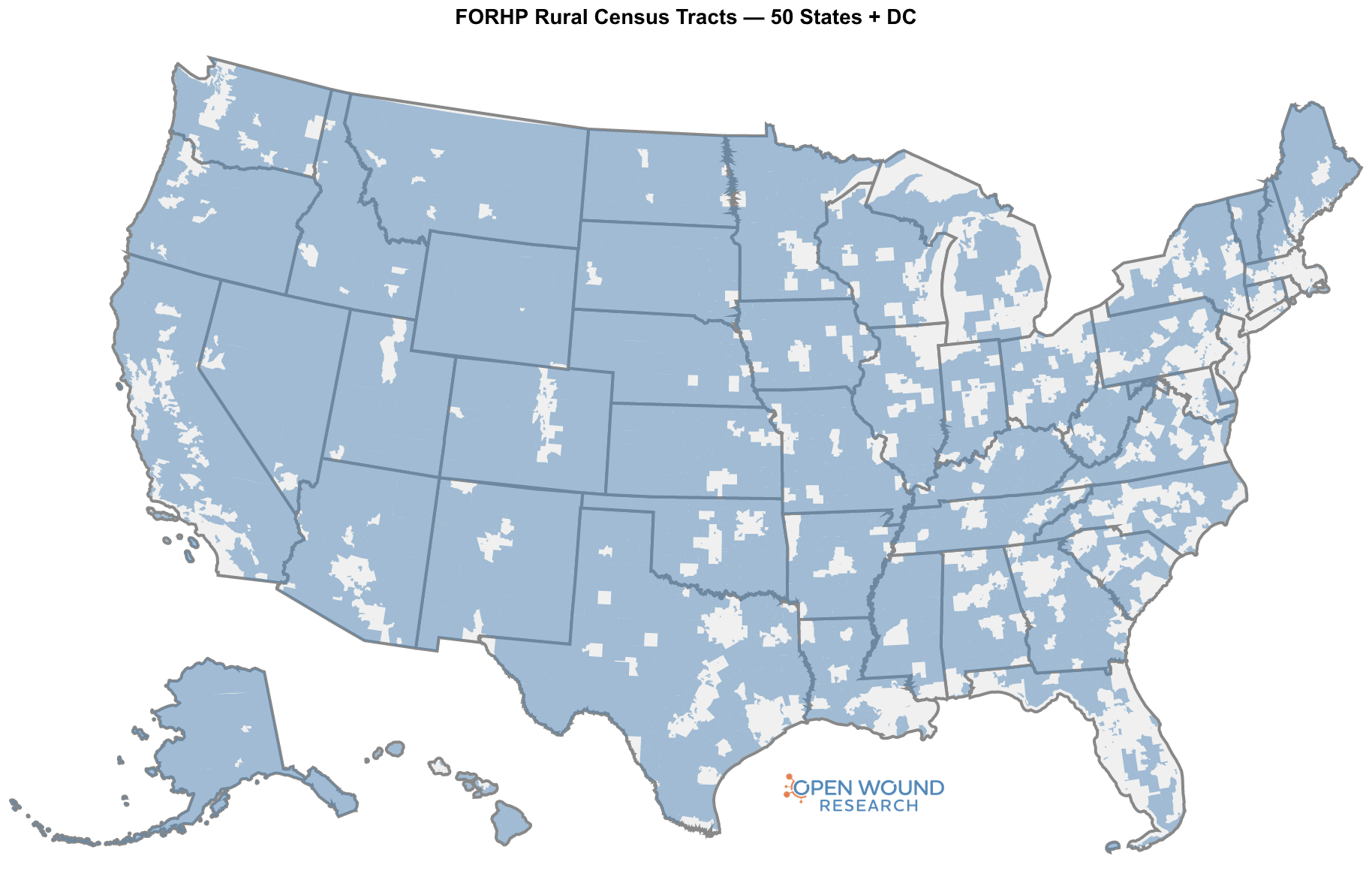
The FORHP rural designation is the broadest of the four geographies. It captures most of the country by land area but a much smaller share of the population, because rural tracts are sparsely populated by definition.
| Denominator | Rural (FORHP=Yes) | Total | Share |
|---|---|---|---|
| 65+ population | 12.88 M | 56.70 M | 22.7% |
| HHA beneficiaries 65+ | 509 K | 2.25 M | 22.6% |
| Nursing homes | 5,173 | 14,700 | 35.2% |
| Certified NH beds | 449 K | 1.57 M | 28.6% |
About 1 in 4 Americans aged 65+ lives in a FORHP-designated rural tract, 12.88 M seniors. The home-health share lands at essentially the same fraction (22.6%), which is what you would expect if rural seniors use FFS home health at roughly the same per-capita rate as urban seniors.
The institutional census tells a different story. Rural tracts hold 35.2% of nursing homes but only 28.6% of beds, because rural NHs are systematically smaller (about 87 certified beds per facility versus 117 in urban areas). That asymmetry matters for delivery models: covering a rural NH census means more facilities per bed than covering an urban census, with longer drive times between them.
HPSA: primary-care shortage areas
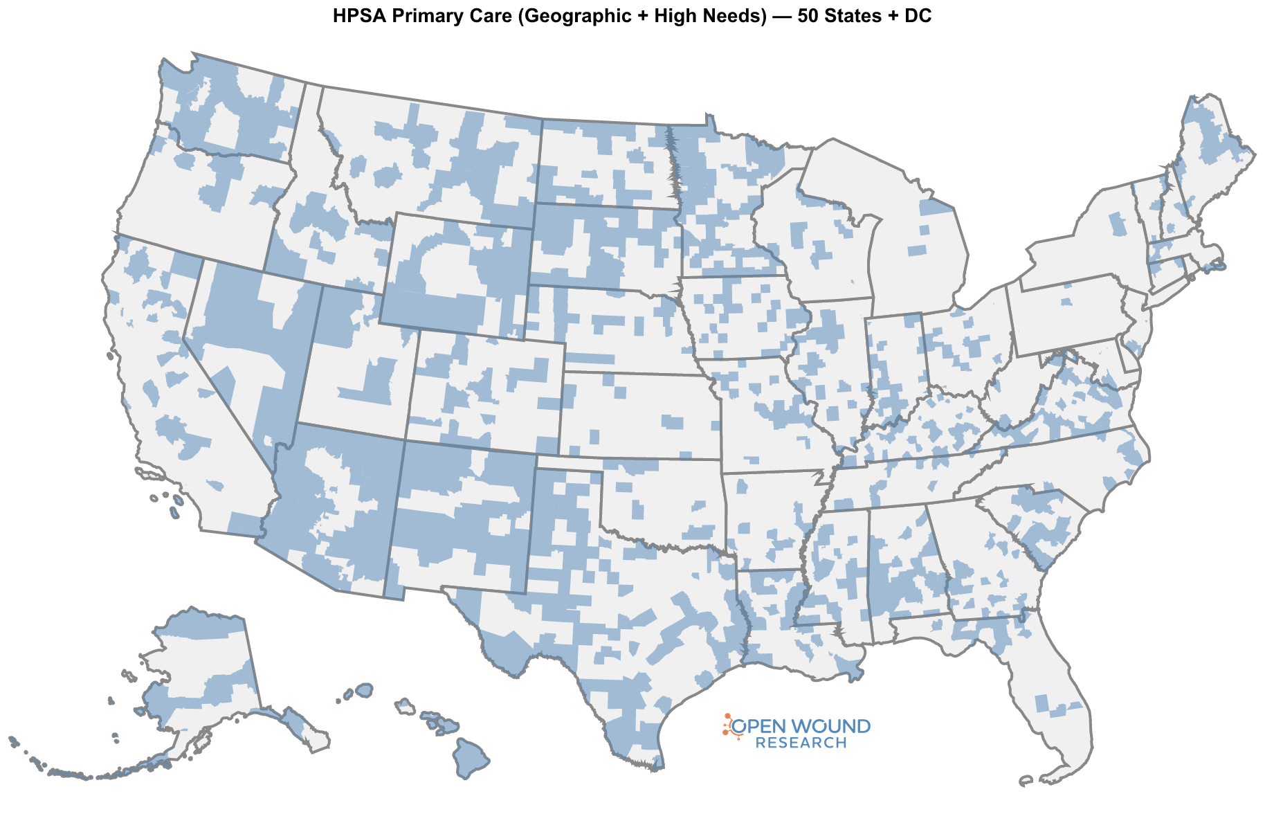
Geographic-HPSAs are the narrowest of the four geographies by population. The designation requires a documented primary-care workforce shortage, and the active service areas cover roughly one in twelve seniors.
| Denominator | In HPSA | Total | Share |
|---|---|---|---|
| 65+ population | 4.95 M | 56.70 M | 8.7% |
| HHA beneficiaries 65+ | 189 K | 2.25 M | 8.4% |
| Nursing homes | 1,530 | 14,700 | 10.4% |
| Certified NH beds | 132 K | 1.57 M | 8.4% |
About 1 in 12 Americans aged 65+ lives inside an active Geographic-HPSA service area, 4.95 M seniors. Unlike the rural designation, the HPSA denominator is roughly stable across the four measures: the population, the home-health benes, and the bed count all sit around 8–10%, with NHs slightly enriched (10.4%) because shortage-area facilities tend to be the only NHs in their immediate area.
HPSA is the designation that most directly speaks to “the doctor can’t come to you,” because it is defined by the absence of nearby primary-care capacity. Inside an HPSA polygon, by construction, there are not enough local clinicians for the resident population.
MUA: medically underserved areas
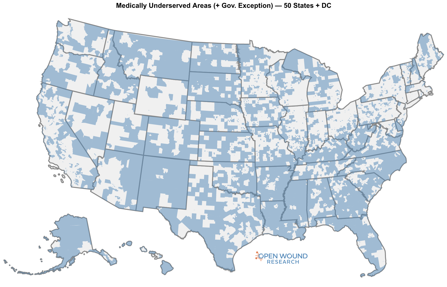
MUAs use a composite score (the Index of Medical Underservice) that weighs primary-care access, poverty, infant mortality, and the share of the population aged 65+. They are the largest single designation in this post by population share.
| Denominator | In MUA | Total | Share |
|---|---|---|---|
| 65+ population | 15.70 M | 56.70 M | 27.7% |
| HHA beneficiaries 65+ | 627 K | 2.25 M | 27.8% |
| Nursing homes | 4,425 | 14,700 | 30.1% |
| Certified NH beds | 435 K | 1.57 M | 27.7% |
More than 1 in 4 Americans aged 65+ lives inside an MUA, 15.7 M seniors. The four denominators sit within a few points of each other, which says the MUA designation is roughly proportional across population, home-health utilization, and institutional census.
MUA captures something the HPSA designation does not: areas where the population is socioeconomically underserved even when the local primary-care workforce is technically adequate. For wound care, where comorbidity burden (diabetes, vascular disease, immobility) tracks closely with the same poverty and age indicators that drive the MUA score, this is the designation that most directly speaks to disease prevalence among the population that struggles to access care.
MUP: medically underserved populations
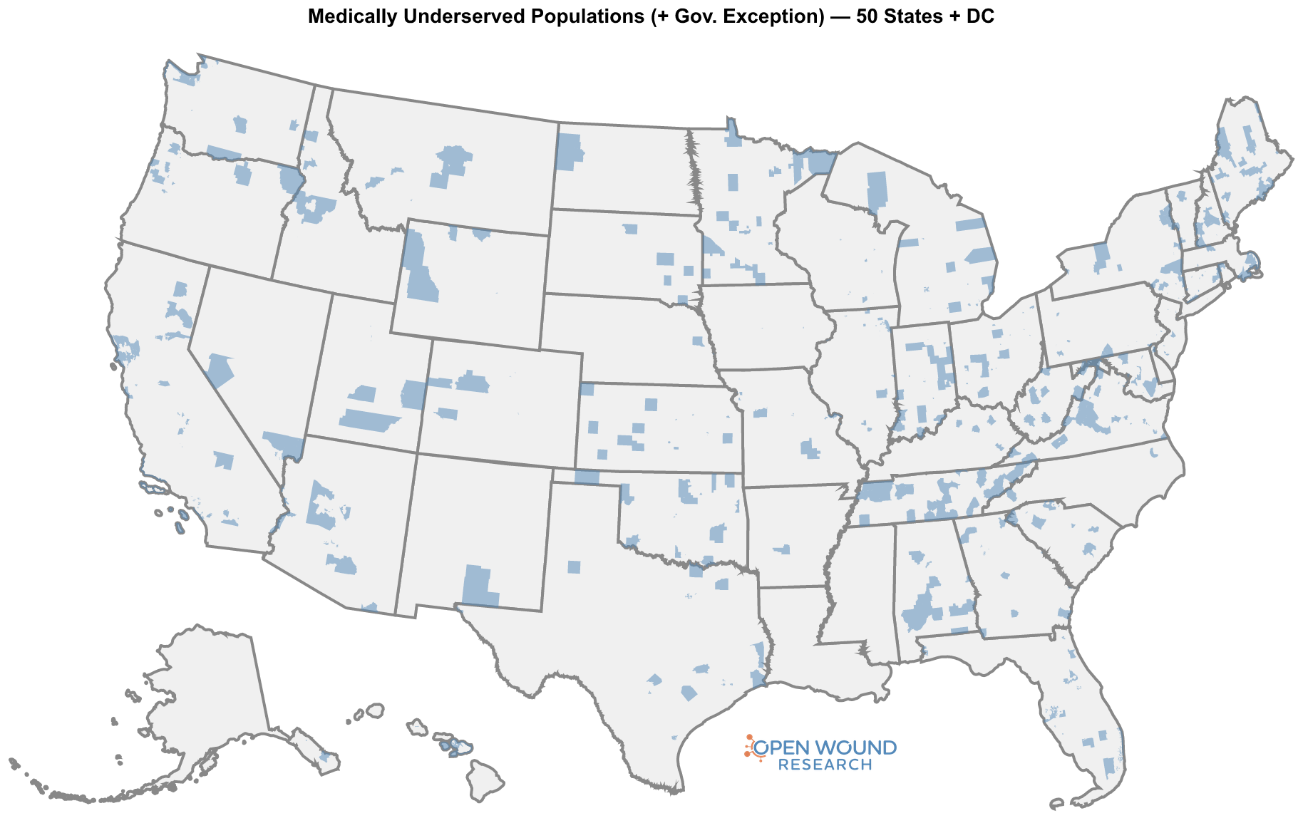
MUPs are smaller than MUAs because they target sub-populations within an area rather than the area as a whole. The geographic count below is the area that contains the underserved sub-population; the designation criteria apply to a specific group inside that area (e.g. low-income residents, migrant farmworkers).
| Denominator | In MUP | Total | Share |
|---|---|---|---|
| 65+ population | 4.34 M | 56.70 M | 7.6% |
| HHA beneficiaries 65+ | 178 K | 2.25 M | 7.9% |
| Nursing homes | 1,252 | 14,700 | 8.5% |
| Certified NH beds | 139 K | 1.57 M | 8.9% |
About 1 in 13 seniors lives inside an MUP service area, 4.34 M. The numbers in the table count everyone in those areas, not the underserved sub-population specifically, so this is an upper-bound geographic count rather than a count of the targeted MUP cohort.
The union: at least one designation
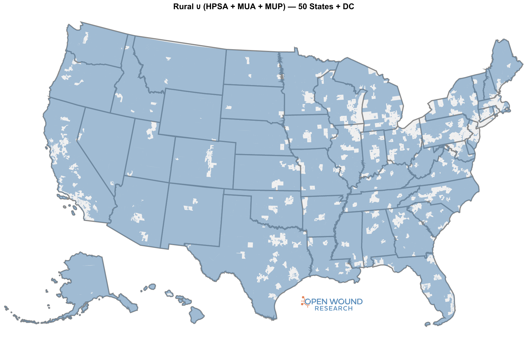
The four designations overlap, so we can’t add them up. The union, the set of tracts that are at least one of rural, HPSA, MUA, or MUP, is the right denominator for “how much of the country has at least one federal rural-or-shortage designation attached to it.”
| Denominator | In union | Total | Share |
|---|---|---|---|
| 65+ population | 25.75 M | 56.70 M | 45.4% |
| HHA beneficiaries 65+ | 1.01 M | 2.25 M | 44.9% |
| Nursing homes | 7,723 | 14,700 | 52.5% |
| Certified NH beds | 752 K | 1.57 M | 48.0% |
Nearly half of seniors, half of FFS home-health benes 65+, and more than half of US nursing homes sit inside the union. This is the broad answer to “how big is the rural-or-shortage piece of the senior care landscape.” It is not a small slice. It is the working majority of the institutional census and just under half of the population.
But the union mixes three very different access situations into one cell:
- Rural only, with adequate local workforce. The barrier is distance.
- Designated only, in urban or suburban tracts with workforce shortage or socioeconomic underservice. The barrier is supply.
- Both, rural and designated. Both barriers at once.
The third cell is where mobile delivery moves from “convenient” to “the only model that works.”
The intersection: the double burden
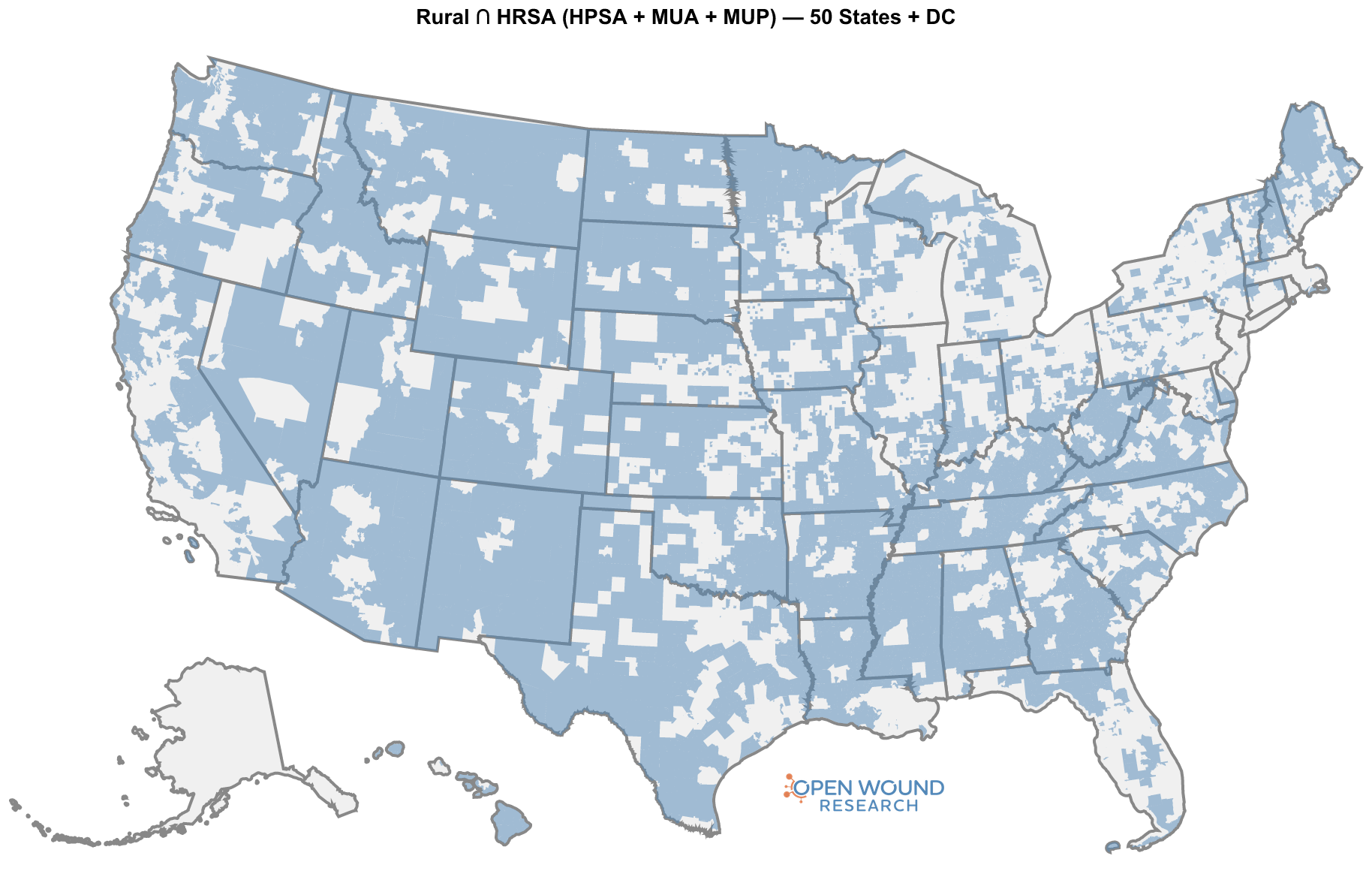
Take the rural cohort and ask which of those tracts is also inside an active HPSA, MUA, or MUP. That intersection, rural AND designated, is the cell where the two barriers stack.
| Denominator | In intersection | Total | Share |
|---|---|---|---|
| 65+ population | 9.09 M | 56.70 M | 16.0% |
| HHA beneficiaries 65+ | 370 K | 2.25 M | 16.4% |
| Nursing homes | 3,602 | 14,700 | 24.5% |
| Certified NH beds | 310 K | 1.57 M | 19.7% |
9.09 M seniors live at the intersection. That is more than the entire 65+ population of the ten least-populous states combined. 3,602 nursing homes, nearly a quarter of the US institutional census, sit inside it, holding 309,736 certified beds. 370,216 FFS home-health beneficiaries 65+ live there.
The institutional fraction (24.5% of NHs) is markedly higher than the population fraction (16.0%), which says the same thing the FORHP-rural table said one section ago: rural NHs are smaller and more numerous per capita than urban ones, and the double-burden cell concentrates that pattern. Covering this cohort means covering more buildings per bed and more miles per building than any other cell in the country.
The four cells, laid out
The Venn partition is the most useful single view of the data. It splits the 65+ population into four mutually exclusive cells defined by the two axes, rural / not rural, designated / not designated, and lets the reader see what the union and intersection are each made of.
| In HPSA / MUA / MUP | Not in HPSA / MUA / MUP | Row total | |
|---|---|---|---|
| Rural (FORHP) | 9.09 M (16.0%) (double burden) | 3.79 M (6.7%) (rural only) | 12.88 M (22.7%) |
| Not rural | 12.87 M (22.7%) (designation only) | 30.95 M (54.6%) (neither) | 43.82 M (77.3%) |
| Column total | 21.96 M (38.7%) | 34.74 M (61.3%) | 56.70 M (100%) |
Read the table by row to follow the rural population (top row): of the 12.88 M rural seniors, 70% are also in a designated shortage or underserved area. Read by column to follow the designated population: of the 21.96 M seniors in a designated area, 41% are also rural. Either way you slice it, the two axes are strongly correlated, the qualitative observation that rural communities are also the ones with workforce shortages and underservice is reflected directly in the geography.
The same partition for the institutional census tells a sharper version of the story:
| Cell | 65+ pop | HHA benes 65+ | Nursing homes | Certified beds |
|---|---|---|---|---|
| Rural only | 3.79 M (6.7%) | 139 K (6.2%) | 1,571 (10.7%) | 139 K (8.9%) |
| Designation only | 12.87 M (22.7%) | 501 K (22.3%) | 2,550 (17.3%) | 304 K (19.3%) |
| Double burden (Rural ∩ designated) | 9.09 M (16.0%) | 370 K (16.4%) | 3,602 (24.5%) | 310 K (19.7%) |
| Neither | 30.95 M (54.6%) | 1.24 M (55.1%) | 6,977 (47.5%) | 816 K (52.0%) |
| Total | 56.70 M (100%) | 2.25 M (100%) | 14,700 (100%) | 1.57 M (100%) |
The double-burden cell holds more nursing homes than either single-axis cell (3,602 vs 1,571 rural-only and 2,550 designation-only). It holds more certified beds than the rural-only cell alone. And it holds more HHA benes than the rural-only cell. The intersection is not a small corner of the institutional landscape; it is the largest non-“neither” cell on three of the four denominators.
Why this cell is structurally different
A rural-only tract has the distance problem but a working local clinician supply. A designation-only tract (urban shortage or socioeconomic underservice) has the supply problem but a clinician could commute in, or the patient could be referred out, without crossing forty miles of two-lane road first. The double-burden cell has both. Concretely:
- The patient can’t travel. Mobility is already compromised (the wound is the symptom of broader frailty), distances are long, transportation infrastructure is thin, and many patients are in long-term-care settings that make outpatient referrals operationally difficult.
- The local facility can’t recruit. The HPSA designation is, definitionally, a workforce-shortage flag. A rural NH inside an HPSA service area is competing for clinicians who are not there to be hired.
- The local outpatient option doesn’t exist. Wound clinics and HBOT centers cluster in the same urban and suburban geographies that the union excludes. Even when a rural senior can travel, there is often nowhere within range to travel to.
Mobile wound care, providers travelling to the patient at home or in the SNF, is the only delivery model that addresses both barriers at once. Every other model assumes one side of the problem is solved.
What the numbers say the qualitative consensus already said
The headline is just the bottom-row total at the intersection: 9.09 M seniors and 309,736 certified NH beds and 370,216 HHA beneficiaries sit in places that are both federally designated as rural and federally designated as shortage or underserved. That cell is 16% of the 65+ population and 20% of the certified bed base, and it is the cell where mobile delivery is not a convenience overlay on top of a working system, it is the system.
The broader picture is also clarifying. Nearly half of the senior population lives inside the union, which is the answer to the older, vaguer question “how big is the rural-and-shortage piece of senior care.” The work that has been done qualitatively, the panels, the trade-press write-ups, the operator conversations, has been pointing at this map for years. The geography agrees with the consensus.
What I think the numbers add is the partition. The union is large and important, but it is heterogeneous. The single-axis cells (rural-only, designation-only) each cover ground that a partial fix could plausibly reach. The double-burden cell is the one where the failure modes of every non-mobile model compound, and it is the cell that the policy, reimbursement, and operator-strategy conversations should be centred on.
What this post does not cover
To save the careful reader some objections:
- Wound prevalence is not modeled here. I have used the 65+ population, FFS home-health benes 65+, and the NH census as denominators because they are the proxies the public data support. I have not estimated the prevalence of chronic wounds inside each cell. Diabetes, peripheral vascular disease, and pressure injury rates all skew toward the same socioeconomic and rural geographies the designations target, so the wound-burden share of the intersection is almost certainly higher than its population share. Quantifying that is a separate post.
- Medicare Advantage beneficiaries are not in the HHA counts. The GV-PUF is FFS-only. Real home-health utilization in each cell is higher than what the table shows, by roughly the local MA penetration share.
- Supply-side analysis is in a different post. This one is geography. The companion question, how many mobile wound-care providers actually serve the double-burden cell, and how that compares to the cohort I sized in earlier work, needs its own write-up.
- Designation churn. HPSA, MUA, and MUP designations are reauthorized on a rolling schedule, and the geography of the intersection drifts as the designations refresh. The numbers here are a snapshot of the active vintage at the time of writing.
Sources
- US Census Bureau, American Community Survey 2019–2023 5-year estimates.
- Centers for Medicare & Medicaid Services, Geographic Variation Public Use File, 2024.
- Centers for Medicare & Medicaid Services, Nursing Home Provider Info, May 2026 release.
- Health Resources & Services Administration, Data Warehouse: FORHP rural tracts, Geographic-HPSA primary care, MUA service areas, MUP service areas, active vintage at time of writing.
Comments or questions? Add them under the LinkedIn post.